Happy July

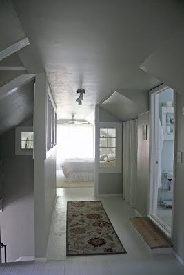
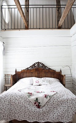
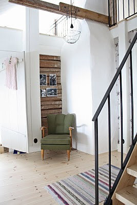
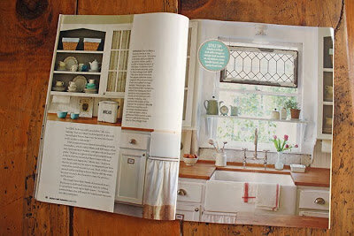
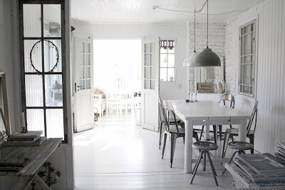
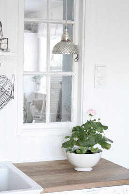
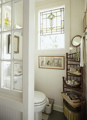
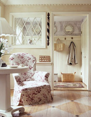
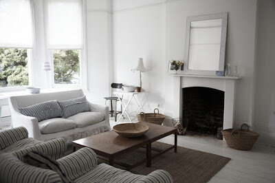
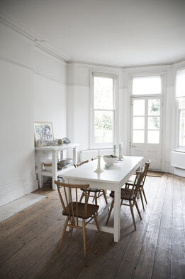
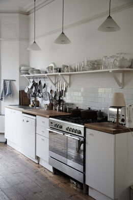
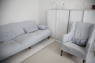
I know I've been gone for a long while and reappearing around here should warrant some sort of explanation, but in truth, I have none.  Life has been good and busy, and I simply wanted to share a few pictures of a sweet feature of our new (old) house in this month's WNC Magazine

My thanks to all involved: Rita Larkin, editor-in-chief at WNC Magazine, as well as Whitney and Dustin Deal, who photographed our home. That was great fun. I also wanted to take a moment to thank my beautiful friend Christie who made the gorgeous jewelry I'm wearing. You can see more of her work at Calaycay Design.

On my mind, lately.

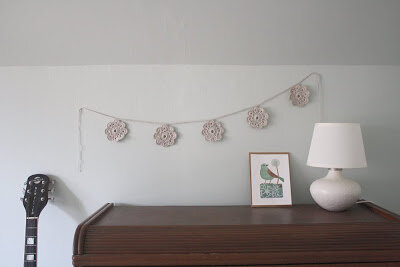
This lovely crochet garland by beautiful Tina. Because when I look at it, I think not only of Tina, halfway across the world in Australia, but also of Allison, following her dreams, and just like all of us, in her words, crafting a life. And I'm inspired by them both.

This little corner in Cindy's living room. Because I am touched and honored that someone who's become a friend would also hire me to help her out in a most personal of spaces: her home. Twice now.

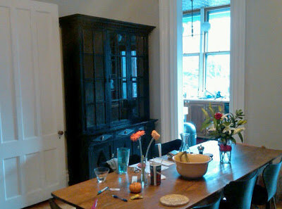
This hutch. Because it made it to Brooklyn from my friends' store in Asheville and it looks great now that it's stained black and has found a new home in my client's dining room.

This new little cross pillow by talented Liane. Because it is the perfect addition to the (ever-growing, Bill would point out with a little cough) pillow collection on our couch.

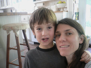
This moment. Because I remember not being able to let a loose tooth be. And because I love my gorgeous, growing boy...

...who, all on his own, decided he wanted to play soccer recently and is loving every minute of it.

This photograph. Because in some ways it represents the overarching way I've been feeling over the last couple of months. A bit overwhelmed and awed by the immensity of life in all its possibilities.

We are moving this spring, and I'm excited but somewhat apprehensive about all of the loose ends that still need tidying up. I am one of those people that needs things to be concretely defined, down to the last little detail - all the time. I don't deal with uncertainty very well, but as my wise friend Florence pointed out to me the other day, ‘We live in a world of shifting tides but pretend like we don't, like we can nail it down.’ And she is right. And the details will get sorted out, eventually. And now, more than ever, I need patience.

Lastly, I'll leave you with this video; it's about 18 minutes long, but well-worth the time when you have a moment. It talks about education (among other things), which has been very much on my mind over the last few months. Fall wasn't easy around here. School turned out to not to be a good fit for our beautiful boy, and in great part it's because of the issues brought up here. (I believe I have Annie to thank for first bringing this TED talk to my attention. Thank you.)

I hope you've all been busy living your lives weaved with your many dreams, my friends. As always, I am sending you all much peace and love. Be well.

(images: 1. me; 2. cindy; 3. jen; 4-6. me; 7. apartment therapy; 8. moving boxes)

Did I ever tell you...

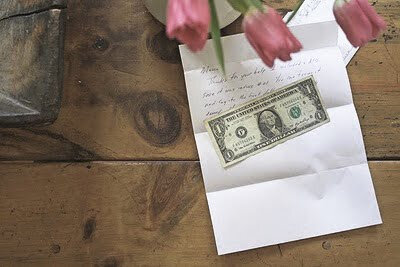
...that after I met with my first paid client, he wrote me a check for the design consult and included a single dollar bill with it for me to frame (as Vintage Simple's first step into the world)?

Such a kind gesture, I thought. And although for some reason I can't bring myself to frame it, I keep it safely tucked away in a drawer along with his thoughtful note.


I am currently working on a couple of projects, including one in Maine, which I'll get to in a minute, and another one in Brooklyn.

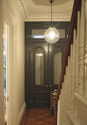
First, I thought I'd share a few little peeks from when I was up NYC in November. Most of the painting in the house is now done, bringing out the gorgeous details of the old brownstone...

Some of the light fixtures have already been put up,


while others still patiently await to be installed...

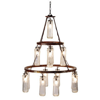
This one, by Cisco Brothers, will go in the parlor. I think it was love at first sight for my client, and it makes me smile to think that it was so. (Such things do happen after all.)

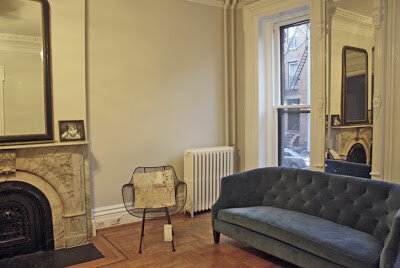
The parlor has a new fun blue couch and wire chair, and a big mirror over the mantel to bring a little more light into the space... It is a north-facing room, so it can be pretty dark in there. I think the chandelier will be a great addition to the space.

We're thinking perhaps a light such as the one you can spy in the next picture will go in the dining room, creating a beautiful foil to the more rustic one in the parlor.

But then again, we may look into having something custom made that relates more directly to the parlor's chandelier, without exactly replicating it. Perhaps something along these lines...


As far as Maine, I thought I'd post some of the sketches I've drawn for my client there, just to give you a little sense of what's been going on with that project.

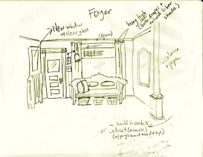
Here's one of the foyer, with a proposed antique Swedish bench, mirror, window treatments, and lighting suggestions (still trying to figure out my new scanner - heh)...


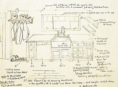
A sketch of the sink wall in the kitchen, filled with sources and recommendations...


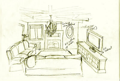
And here is one with ideas for the lounge/TV area in the living room...


Both projects are still, clearly, far from being completed, but I thought I'd share with you a little bit of what I've been working on for the last couple of months. These things do take time - what with the business of living, and budgets, and dreams... but the work itself is great and I am happy to report that I am thoroughly enjoying it.

On a more personal note (related to this idea of dreams), I've been trying to watch myself more closely, paying attention to all these hopes and plans and dreams of mine. And as I watch myself trying to stubbornly hold on to them all, I am also painfully aware of my wish to rush them into certainty right away. But that is not really the way life works... is it?


And so it is that I hold my many dreams with my many imaginary arms... And I am starting to think that perhaps the trick lies in the holding - with purposeful intent, but patiently and...lightly. Ever-so-lightly. And always (always) with an open heart.

So, I am working on finding more balance in the way I hold myself and that which is dear to me, including my dreams. And I hope that with each passing year, I will be able to hold myself and my goals more lightly - in a more forgiving, quiet way.

It is not a complete thought, I realize - but it will have to do for now. I am wishing you all peace, my friends - now and always. See you at the other end of 2010.


(images: 4. cisco brothers; 6. rebekah sigfrids via design sponge; 7. photo by richard powers, collaboration for lights - fearon hay and katie brown; 11. & 12. katie daisy's etsy shop; all others by me)

Progress

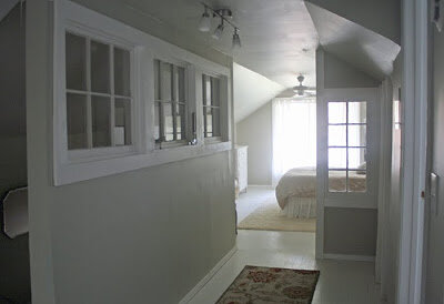
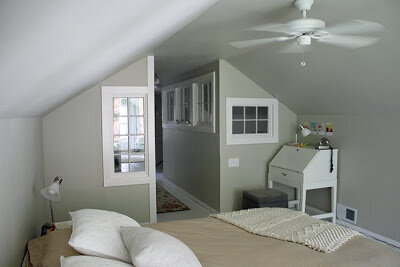
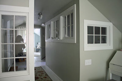
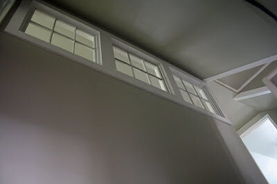
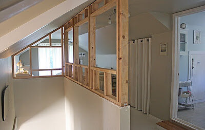
Well, the wall with interior windows is finally done...and I couldn't be happier. It really does look lovely, and the photos hardly do it justice.

Our friend David* was kind enough to come help us finish up. I was really tired of the inevitable clutter and disarray that come with weekend projects of this scale, so it was wonderful to have an extra set of hands - and one so talented at that.

It was a lot of work, but really worth it in the end... I can't imagine a better solution for this space. What was once an open attic expansion lacking definition is now a beautiful space that allows for separation without sacrificing light.

I also love the way enclosing the staircase gave it an incredible sense of volume - it looks so grand now..! It feels completely decadent to go up the stairs, lured by the inviting light streaming through those windows...


In other news, I have been very busy with clients and have even traveled to Maine (!!) to help one of them, and I am going to Brooklyn next month to visit yet another client (!!!). So, all very exciting things for someone who just a little bit over a year ago started this blog with a dream of sorts that is now slowly, quietly, but surely coming true. There are no words to describe how lucky I feel... And grateful, too. Incredibly grateful. I am getting to do what I love, which is...well, priceless, really.

So, I would like to officially announce that I am available for design assistance, and I will gladly help you with projects big and small. I will even travel - as long as all expenses are covered and my schedule allows it, of course. For more information, feel free to contact me.


*if you live in the Upstate of SC or WNC region and you need a terrific craftsman, let me know and I will put you in touch with David - he is fantastic and fantastic to work with.


(images: me)

Projects, lately.

Remember how our bedroom is upstairs and it's a little bit quirky the way most attic expansions can be? Quirky in a charming way, but you know, quirky nonetheless...?)

As you come up the stairs to the second floor, we have a half wall and therefore our bedroom area feels somewhat exposed. So I've been thinking about how to give our space a bit more privacy without closing it off completely...

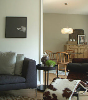
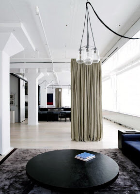
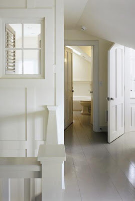
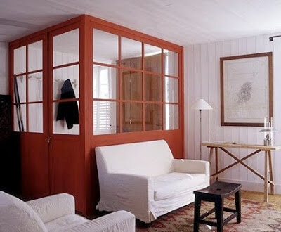
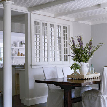
I think I'll be aiming for something along the lines of these photographs for this project. You'll have to take a little leap of faith by disregarding the particular details, and simply embracing the overall feeling - given that we don't have the beautiful beadborad, nor do we have the exposed lath, gorgeous beams, or incredibly tall ceilings that grace the bedroom in these pictures...

In essence, though, we'll be going for something that is still a little funky, but soothing and pretty, and definitely somewhat unique given the space constraints (or advantages, depending on your take).

Something that allows us to capitalize on light and still gives us a little bit more of a sense of privacy - but somewhat playfully and resourcefully...

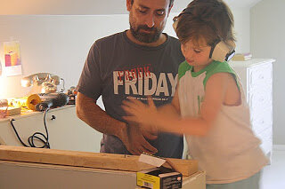
Although we're nowhere near finished, I thought I'd share with you some photos of the progress so far. Here are the boys, busy at work (Noah has sensitive ears, thus the gear)...

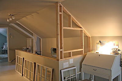
The first wall going up and the pretty windows all lined up (which I scored from a neighbor who was discarding them), patiently awaiting their second round in life...

The studs and frame all in place for the second wall...

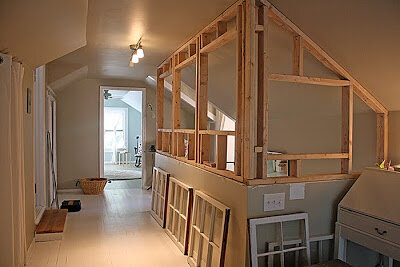
And, here, the view from the other end, into our bedroom and a sliver of our bathroom...

I will post pictures once we're done. Hopefully it will be sometime before the end of the year. As the weather gets cooler (soon, soon!), we'll be wanting to spend more and more time outdoors, and inside projects will have to be put on hold as a result. So, we'll see - but I will definitely keep you posted once we're done.

On a slightly different note, I've also been working on a couple of little rooms

*inspired by this,

and this,

as well as this,

and this,

and this sweet, little print:

So, creative and productive times here in our little corner of the world. All of which is good for my spirit. I hope this post finds you all having the kinds of times that are good for your spirits, too. I am sending you all much peace, my friends. Be well tonight, and always.

*for a client, so don't be getting any ideas..!

(images: 1. & 2. via vintage; 3. via canadian house and home; 4-7. me; 8. via isak; 9. via cookie magazine; 10. via domino magazine; 11. via country living; 12. via katie daisy)

Pretty

No deep thoughts here today. Just lovely photos by Anna Kern of a gorgeous little home in southern Sweden.

I love the vintage posters paired with the subtle colors on the walls and the punchy prints of the sweet fabrics and that aqua frame;

the easy camaraderie of perfectly mismatched furniture all coexisting in graceful harmony;

...and those stunning yellow doors? Yes, yes, and many times over, yes. And please. And thank you.

As a little side note, I'd like to thank you all again for your kind notes lately - I really appreciate every single one of them.

That's it for now. I hope everyone has a good weekend.

(images: via the ever-inspiring my scandinavian retreat)

It's here!!

Well, my friends, the magazine featuring our kitchen and bathroom has hit the stands - and our kitchen is on the cover!!! I'm pretty flattered. And happy. And frankly, I'm blushing a little. And-and... I'm rather speechless, actually.

Many thanks to associate editor Rachel Haugo for spotting our kitchen on Design Sponge and starting this amazing process; to writer Suzanne Morrisey for being such a pleasure to work with; and to Marie McCartan for writing such a kind introduction in the editor's letter. I'm incredibly grateful to you all. Thank you.

The magazine is called Kitchen+Bath Makeovers and it's a publication of Better Homes and Gardens... you know, in case you feel the urge to go out and buy it. (Just imagine: you'll get to see Brie's lovely photography in real life, which is, in and of itself, absolutely worth the money.)

My apologies to local folks, though - between Bill and I, we may have bought all the copies available in Greenville, SC.

Oh, I kid, I kid..! (Sort of.)

Here is a picture of the cover - I sure hope you get to at least take a little peek while you wait in line at the grocery store or sip coffee at the bookstore..!


(images: pictures of photographs by brie williams)

Lately

I've been dreaming of going away. Just for a little while. I've been fantasizing about having a little cabin tucked away somewhere beautiful, where life would just naturally take a slower pace. A place like Pippi's summer cabin overlooking the water in Norway would fit such a dream, don't you think..?


For more inspiring images and words about this labor of love, click here.

(images: my scandinavian retreat)

Much.

Much has happened in the last few weeks. I've reconnected with my brother after a long stretch of silence and that has been wonderful - in fact he came to visit, which was even more wonderful. There have been many visits with cousins and family and friends; long walks around the neighborhood; pets lost and found and lost and found again (thankfully). The boys planted tomatoes, carrots, sunflowers and corn in the backyard while I recovered from a cold. It got really, really hot and then got chilly again, and now it goes back and forth, between brisk mornings and sultry afternoons. The flowers are in bloom and the trees exploded in a huge collective sneeze of pollen that covered everything in yellow dust and gave us all scratchy throats and watery eyes for a while.

Life, my friends, has been eventful and intense and beautiful, and we've been busy living it. But here I am, my dears. To let you know I haven't forgotten about my little space here. Or you. I've just been...well, quiet, is all.

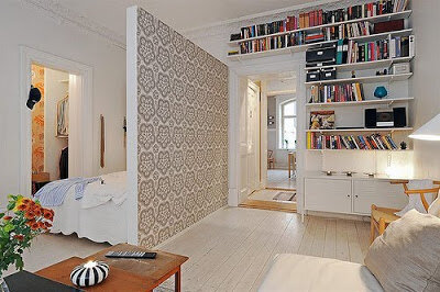
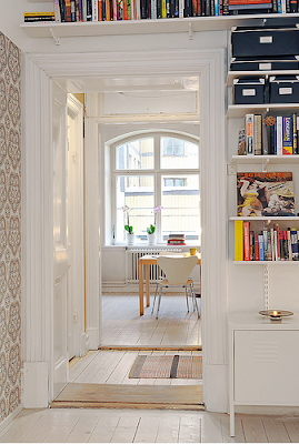
We're still thinking about downsizing, and although we wouldn't be looking to swap our house for anything this small, I immediately fell in love with this Swedish apartment - for its generous use of white, the pops of wallpaper in just the right amounts and on just the right spots, the fantastic use of space, and the apparent ease with which choices were made to make it look so effortlessly lived-in and well-designed at the same time... I think if I had to live in 500 square feet, I'd try to make it look something like this.


At any rate, my friends... I hope this post finds you all well. More soon, eventually.

(images: via apartment therapy)

Interior Windows

Remember this post I wrote a while ago..? I keep coming back to it for many reasons, but one of the most inspiring things about Johanna's space to me is the use of interior windows throughout her home. I can spot three of them in the above photo alone...

I love natural light, and using old windows that might otherwise end up in a landfill seems like a wonderful idea to let in more light...

I like them as a way to suggest privacy - somewhat playfully...

I like them in entryways,

and as mudrooms...

Sometimes, I even like the idea of interior windows in place of knocking down entire walls... And not only because it might be a way of saving storage or counter space, but also because - isn't it alluring to just get a peek into the next room over, without sacrificing the sense of intimacy that smaller spaces create..?

A suggestion of what lies beyond and the promise of loving light ahead... Yes, I think I like this idea. I like it a lot.


(images: 1. & 2. vintage; 3. via kitchen and bath ideas; 4. banks design associates; 5. via the goodie life; 6. via renovation style magazine; 7. via canadian house and home)

Just enough

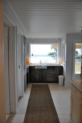
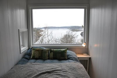
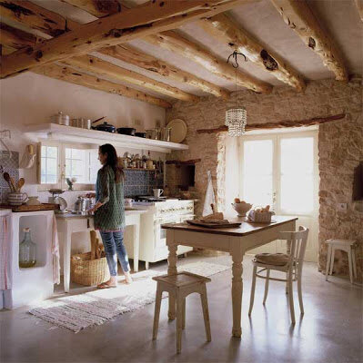
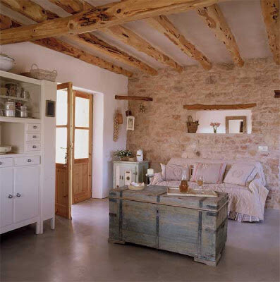
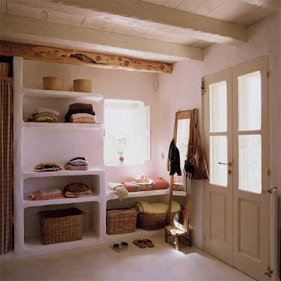
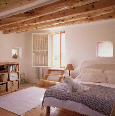
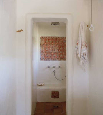
Sure, this house has a lot of the usual attributes that generally make me happy in a home: the white walls, the rough-hewn wood, the use of natural materials left exposed, and the beautiful tension between rustic, glamorous and simple.


But perhaps what draws me the most to this particular home is its scale.


For a little while now I have been craving the coziness of smaller spaces; I've been dreaming of finding a smaller house - one where no room goes unused, and no corner is left unattended, especially now that we've finally made the decision to have no more kids...


...and this house seems to fit that fantasy. For me. At this particular moment in my life.

We'll see, my friends. Only time will tell.

(images: jordi canosa)

Psssst...!

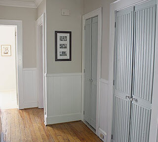
Lovely Leah at Apartment Therapy surprised me by posting our little bi-fold door project here. Go take a look, if you feel so inclined, and check out the other two great DIY ideas for door updates. You won't be disappointed - I promise.


Thank you, Leah! It truly was a sweet, unexpected surprise and an incredible honor. You made my day, dear. And as Bill is fond of saying, Happy Little Friday, everyone!

(image: me)

Friends. Etsy. Love.

Since I started blogging last year, I've come to know some pretty spectacular and ridiculously talented women. And as we've slowly become friends, I've tried to purchase a little something from each of them so that I can have them close to me and think of them at unexpected moments - like while I do my dishes; or right before I turn the light off to go to sleep; or as I look for mascara in hopes of making my sleepy eyes look less tired in the morning; or as I catch a glimpse of myself in a mirror and see the little sparkle of an earring or necklace...

Sometimes it'll happen when I'm looking for a bowl that is just the right size for a snack; or as I leave home in the frazzle of morning and look up from the black hole that is my purse to see a lovingly-made pillow...

Or it may happen as I stop to think for a minute, while sitting at my little desk upstairs in my bedroom, and see a row of beautiful pictures, all lined up, anchoring me in time....or when I see a pretty card, leaning against said desk, reminding to smile...

It is at times like these that I think of some of the new dear friends I've made on this journey.... And it makes me so very happy to think of them as being part of my everyday life here at home, even if it's in a small way.

So today, I'd like to share some of the beautiful things that have made their way from Etsy to my home...won't you take a look with me?

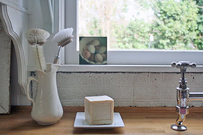
Traci's beautiful photograph of pretty eggs from her shop, Blissful Images.

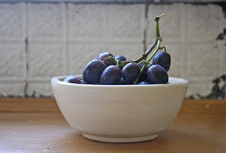
Denise's bowl, its glaze the most perfectly subtle shade of cream I've ever seen, found at Chez Danisse.

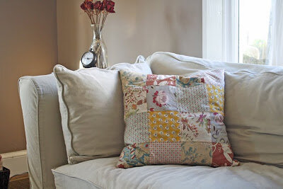
Rebekah's gorgeous patchwork pillow (which, incidentally, inspired this post) from her wonderful shop, Little Byrd Vintage and Handmade.

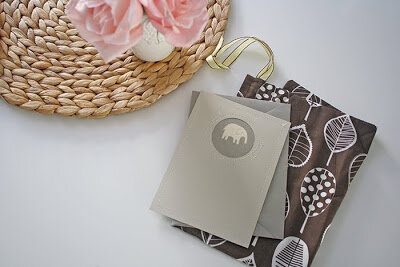
Cindy's carefully crafted card and bag, found at Pretty Neat Designs.

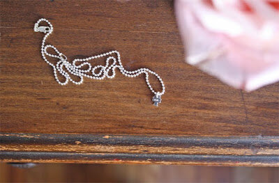
Melissa's perfectly delicate necklace, from her wonderful shop, Acts of Kindness.

Jill's cheerful zip bag, the best companion for these gray and cold winter months, found at her lovely shop, Jill Bent.

Beautiful photograph by beautiful and talented Cara, of Peonies and Polaroids.

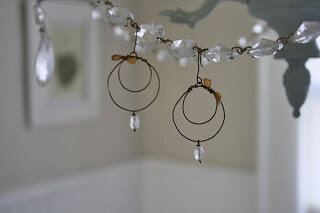
Michelle's lovely earrings, perfectly bohemian, found at Blue Moss.

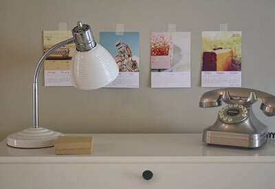
And last but not least, Azzari's wonderful 2010 desktop calendar, which you can find (along with other beautiful work) at her shop, Gabrielle Kai Photography.

When you have a moment, do stop by these women's wonderful blogs and shops.... You never know - you may even end up making a new friend, just like I did..!

(images: me)

Quietude

I've been walking around feeling a little bit dazed with all that's been going on lately. It has all been terrific and a little bit terrifying at the same time, and as a result, emotionally, somewhat exhausting.

Between the photo shoot, and following a couple of leads for doing design work (maybe - we'll see), and keeping up with my part-time job at a nonprofit, and being a mom and wife, and continuing on with other general domestic duties, I must admit I've been feeling somewhat overwhelmed. So. What do I do at times like these..?

I come back to white interiors. And Jane Cumberbatch. I will never tire of her home. I know I've posted photos of it before, but it looks like these may be a little older (or newer?) as the house is styled with an even greater abundance of soothing whites in these pictures - which is exactly what I need to look at when I'm feeling slightly frazzled by life. I hope you'll enjoy these as much as I do...


(images: via the ever-inspiring bliss)

A bright and happy place

My dear friend Florence, a wonderful writer of stories for young people, asked me a little while back if I would write a post about a place I thought would suit her...

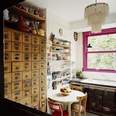
I haven't had a chance to come up with a whole house or apartment for her, but when I stumbled upon this kitchen, I thought of her. It's a little bit bohemian and girly, and even though she might protest the girly label, it's just her style, I think.

The pink on the window frame, the old Hollywood glam chandelier in such a utilitarian room, the warmth and texture of the many wooden drawers and vintage pulls on that piece (not to mention the playful scale of it in the room); the somewhat flirty, sheer curtain under the sink, the easy comfort with which mismatched chairs and plates and pottery accumulated over the years all coexist in perfectly inspiring harmony.... Yes - it all speaks of beautiful Florence to me.

Wouldn't you agree that this kitchen belongs to a wonderfully warm, interesting, and creative person...? I think so. And such a person is my gorgeous friend - my dear Florence.

Do make time to visit her little corner of the world, Cate's Folly when you have a moment... You'll find a little taste of a mid-grade comedy she's been working on called Gas for Pluto, a wicked recipe for tomato-nut soup, musings on being a writer and how to get published, and an inspiring post on the need to create picture books tailored to the specific needs of kids with autism, among her many wonderful entries.

(image: marie claire maison)

Photo shoot!

Okay, my dears, I'm sorry it's taken me this long to get back into the swing of things, but here you have it: what kept me busy and happy last week was that Better Homes & Gardens was here to photograph our kitchen and bath!!!

I had such a great time..! And I can't say enough kind things about the team that came over to the house. Sandi, the field editor/stylist, was wonderful. She was funny, considerate, and has been doing this for some time, so she had an amazing ability to anticipate how the vignettes would look like on film (which, surprisingly to me, is quite different from how they might look in real life, both color- and composition-wise).

She was also incredibly patient with my constant questions and requests to move things or try this or that instead, and she even let me style a little (!!), which was not only incredibly generous of her, but also made me realize how much fun styling is...!

Brie, the photographer, was incredible - it was truly a gift to see my house come to life through her eyes. She is ridiculously talented and I encourage you to visit her site here. You will not be disappointed.

And then there was Mike, who helped Brie with everything from technical issues to (I kid you not) holding our ficus tree outside the window so that our neighbor's somewhat messy back porch would be hidden from view. He was, needless to say, indispensable.

I wish I had captured a shot of him holding up the tree..! Unfortunately, I didn't, but here are a few pictures I took that I hope you'll enjoy and will help give you a sense of what a chaotic scene it can be right outside the camera frame when you are doing a photo shoot...
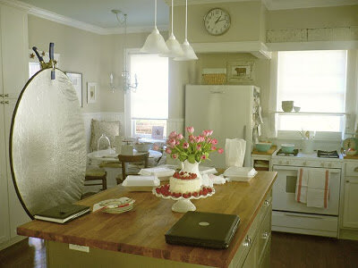
The pretties - cake and raspberries on a beautiful stand, and gorgeous tulips in an ironstone pitcher (pay no attention to the surrounding madness).
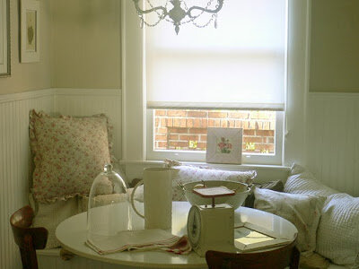
The not so pretty chaos.
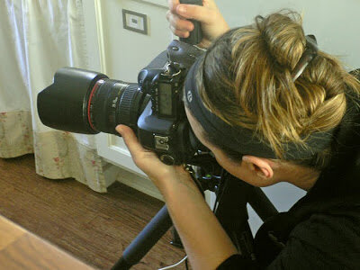
Lovely Brie at work, secretly wishing walls and kitchen islands would be more helpful and move out of the way so that she could do her job more easily.
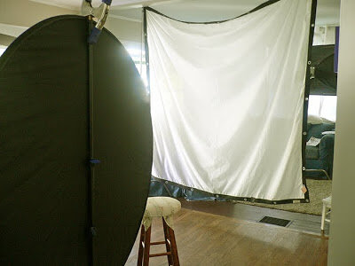
Gear. Tons and tons of cool gear.
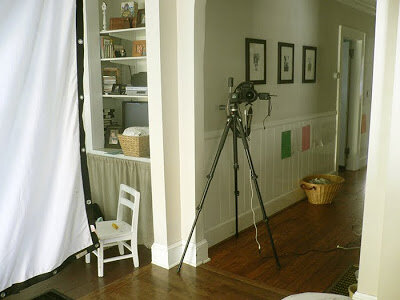
The camera resting on its tripod while things were being set up.
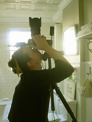
More contortions from poor Brie to get just the right shot.
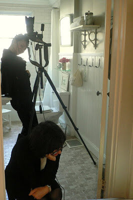
Sandi inspecting the shot and making mental notes about which things would need to be moved one or two inches this way or that, and such.
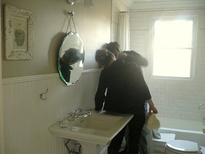
Mike and Brie working on the camera's focus in a rather tight space (again, if the house's walls would be a bit more cooperative and flexible..!)
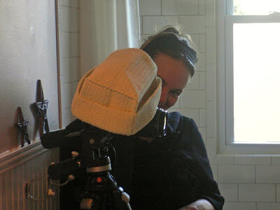
Highly technical gear - not to be confused with the Ikea Komplement basket.
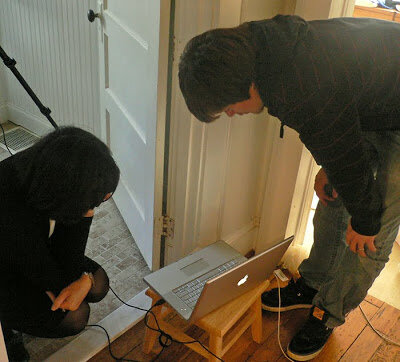
Sandi, with Mike standing by, studying the shot, and getting ready to call it a day. And what a wonderful couple of days they were..!

If you guys (Sandi, Brie and Mike) happen to be reading this: I had the best time. The house felt a little bit empty after you left... Thank you for your generosity and the privilege of allowing me to watch you work. I feel like I learned a ton and I have renewed love and sense of commitment for design.

The magazine is called Kitchen & Bath Makeovers, a quarterly publication of Better Homes & Gardens. Sandi thought the kitchen would be featured in the Spring issue, perhaps on the cover (eeeeeeep!!) and the bath might be published in a later issue. I can't wait to see them in print!

(images: me)

My Buenos Aires

After writing about Hotel Home last week I got a little homesick and decided to look for some photos of homes in Buenos Aires to post here.

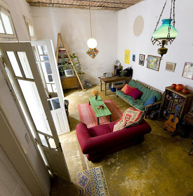
I looked around some and I even started a post with pictures of apartment rentals in Buenos Aires... But invariably, I kept coming back to this home, which has been in my inspiration files for a little while now, and is by far one of my favorites. The other places just didn't move me the way this one does. And so it was that I started over.

There are many things about this place that remind me of my grandmother's house, where I spent a good part of my early years while my parents figured some things out. And so in many ways, when I think of Buenos Aires and home, this is the type of place that comes to my mind...

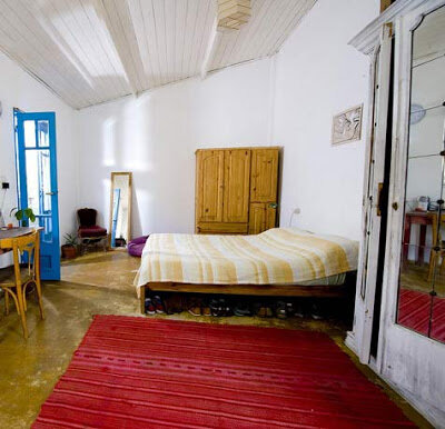
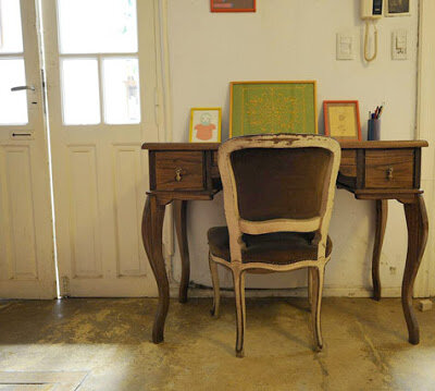
Sensible concrete floors (not stained at my grandmother's, but left natural), lots of white on the walls, soaring ceilings,

and incredibly tall double doors into each room... these all take me back to her home, to my Buenos Aires.

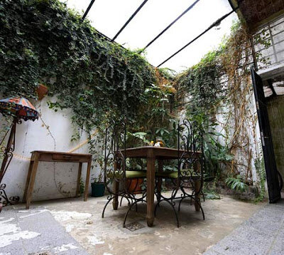
But of all these details, perhaps this next one is the one that most readily transports me to my childhood: the central patio.

My abuela's house also had an interior courtyard, although instead of glass, it had a really old grape vine in place of a ceiling... It filtered the sunlight and rustled quietly on breezy days, and best of all, it gave plump, delicious fruit in late summer, which we plucked and ate, still warm from the sun, directly from that vine.

I still remember, very vividly, this image of me (maybe 3 years old?), my hair freshly braided, being carried by my grandmother across the patio in her strong arms, the light and shadows dancing around us as we walked under that vine. It is one of my happiest memories - perhaps because I felt so safe and loved.

The kitchen was at the end of the patio, completely separate from the rest of the house. Since the patio was not covered, my grandmother's kitchen had windows and a door instead of being wide open, but it was simple and utilitarian just like this one.

Other than that, I don't really remember the details of my grandmother's kitchen; I remember that it was small and cozy, and that there was an old table (with legs painted the most beautiful red) under the window, overlooking the patio.

My brother and I used to sit at that table eating shredded apples sprinkled with sugar while my grandmother busied herself with the mysterious things that take up grown-ups' lives; and we watched and wondered, and looked at the curious play of light and shadows that lay ahead.

(images: by caitlin m. kelly via design sponge)
New glass knobs and one sweet discovery

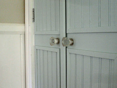
So, remember those bifold doors we turned into little french doors..? I told you about them a couple of weeks ago...? (See here, if you don't remember.) Well, we finally got the knobs, and I think they're lovely. Take a look:
They add the perfect finishing touch to the doors, don't you think..?

What I neglected to tell you in my earlier post is that, while doing the work, we had a little, uh... accident. I forget how it started. In a really silly way, most likely. It was probably one of those "We can't do it - it'll look dumb/ Of course we can do it - fine I'll do it all by myself!!" moments...

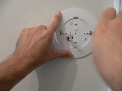
And so it was that I found myself wrestling with the bifold, trying to take it down all on my own... And I succeeded - only it landed squarely on the thermostat. Sigh.

Bill quickly put aside our little spat (and suppressed some serious laughter, I'm sure), coming to the rescue since I was caught in one of those I-almost-saved-it-but-didn't-quite-pull-it-off positions, awkwardly holding the door which had caught my ankle at one end and smashed the thermostat at the other. He gently assured me that it wasn't a big deal and helped me untangle myself free from the door, while I just berated myself for being so stubborn. (I think I was probably a little embarrassed, too, not just angry. Heh.)

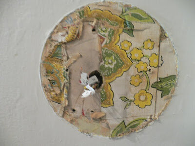
The one cool thing about this little episode was that when we took the old (really old) thermostat down, we found one of those sweet surprises old houses can give you:

Isn't that tiny bit of vintage wallpaper the sweetest..? I love it when little unexpected things like these happen. Anyway, I debated whether I should take it down and frame it or not, but I decided to leave it with the house, so that it can tell this story again through someone else some day.

So, we covered the little treasure, with Bill doing most of the work, and me getting in his way, trying to document it...

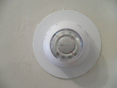
And there you have it. The same exact thermostat, sadly made out of plastic instead of metal...but, oh well. At least it's white, rather than brass. I guess that's an improvement, visually speaking. For me, anyway.

Buenos Aires cool

Last time I visited home, my best friend's mom insisted that we stay at her place . (She stayed with her niece while we were there - have you ever heard of such ridiculous kindness?!? Insane. That's how incredibly generous people can be. Still blows my mind away.)

Anyway, I just spoke with her the other night and again she pronounced that if we came to visit, we'd stay at her place like last time. How can one resist such a tender, generous gesture..? It would be rude. Foolish, even, since it saves us from having to pay for an apartment or hotel room...

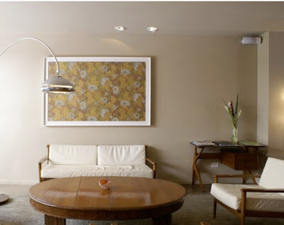
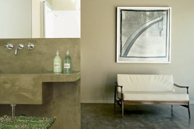
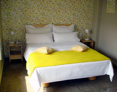
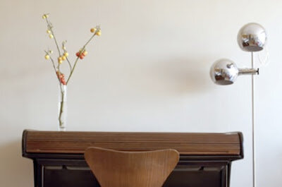
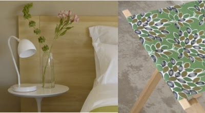
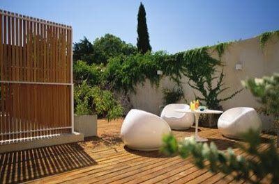
Which brings me to the point of this post: Hotel Home? In Buenos Aires? I may have to check this place out just for fun...! Chalk it up as a tourist destination... (My poor kid and husband are saints. Truly.) Here, take a look - so simple and stylish and filled with vintage details:


...Isn't it incredible? I thought so. The modern lines paired with the vintage pattern of that wallpaper? I love it. Love.it.

(Sure enough, this post has made me a little homesick, so I think I'll look around and see what other cool interiors I can find online that hail from Buenos Aires.... Stay tuned for more to come..!)

(images: hotel home via remodelista)